
Sign-Up + Connect
From sign-up to account verification, coherent user flows inspiring trust and confidence

The Problem
Our company manufactures connectable devices in a regulated industry. In order to connect their products, customers needed to contact our IT department to manually validate their accounts for data security purposes. This created friction and unnecessary effort in our customer’s first-time experience.
Client
My Role
Tools
Figma, Miro, Zeplin
Confidential*
UX Designer (1 of 2)
*In cooperation with my terms of employment, client information is omitted. The material here is substituted or modified from the professional work it represents. Please reach out for details.
Constraints and Limitations
Like most projects, timeline constraints and technical feasibility were key considerations in my design decisions. I collaborated closely with stakeholders to sort out the details.
-
While some newer patterns from our design system would benefit the use cases we designed for, timelines were tight. We opted to use existing shared components for the MVP to minimize the technical effort.
-
The process to verify new customer networks–and the restrictions of unverified accounts–would not be determined by Legal before we started our designs. I built in some flexibility, and acknowledged that we may need to pivot, depending on the verification process (AI, automatic, manual, etc).
-
These user flows are unique to onboarding and verification scenarios. They are not primary user tasks. They may warrant new patterns to optimize first impressions, but only if those patterns weave seamlessly into the bigger picture, without disrupting intermediate users.
The Solution
While data security is a concern, we should let users get started with limited access—even if it’s an unverified account—and keep them informed about their account status.
That way, users can enjoy the features we promise them without compromising information security.
Mockup, log-in screen for portal

User journey, happy path summary from sign up to verification
Maintaining A User-Centered Mindset
These design principles and UX best practices were top-of-mind for this project.
-
Without signing up, users cannot connect their products for the most valuable features we provide. Also, IoT products are notorious for complex setup flows, rife with emotional friction. Strong UX Writing should guide users, and also show them how each step leads them closer to completing the flow successfully.
-
Users want to get started with minimal effort. But there is also a need for account verification; otherwise, customers’ competitors could act as a member of that network, and access their data. I struck a balance between spelling out the (admittedly complex) verification process, and simplifying the workflow.
-
Although these workflows are critical to gaining a trusting relationship with our customers, they are not the centerpiece of our services. Any patterns we introduce should be easily learned, and reusable. Moreover, the underlying complexity of the process shouldn’t upstage a minimalist design.
In collaboration with cross-functional stakeholders, we ironed out “forks in the road,” and technical details.

User flows, network verification

Timeline, launch dates by quarter
Inspiration
Although users can register a product as a guest, an account is required to connect. A connection enables most valuable features. Showing an application’s value on the sign-up screen is a well established pattern. I gathered some inspiration to inform ideations on this concept.

Screenshots, inspiration for “Get Started” screen

Sketches, “Get Started” screen
Considerate Copy
If the system needs to ask users for something, it should explain why it benefits them.
Here, I engage users in a dialog, explaining why they would want to fill in their company details. The conversation is empathetic to the effort required to fill in the form. It also balances detail with simplicity.
I considered the overall consistency of this copy with the rest of the user flow, and our company’s writing guide.

Mockup, company information in sign-up flow
Minimalist, Scalable Patterns
A network’s administrator needs to see unverified users on their “Users List.” That way, they notice that some new users have limited access.
At first glance, this is a new use-case, warranting a unique pattern. But in the future, we may have similar use cases to subdue content–for example, unavailable features on a user’s subscription tier.
Adjusting the information design by learning into shape and contrast, I introduced a “subdued” variant, which reads clearly, and can also apply to other use cases.
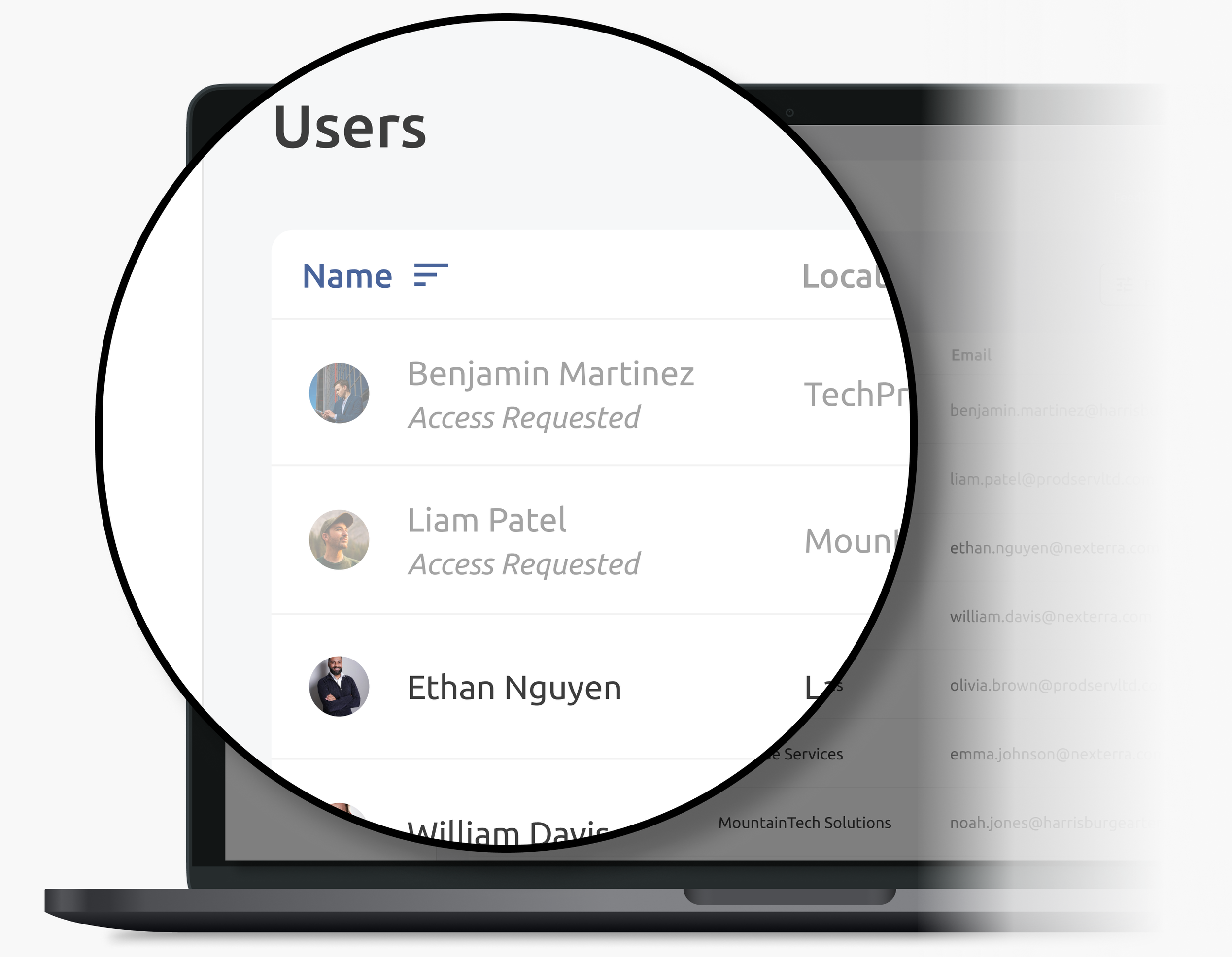
Mockup, Users List with subdued rows
Progressive Disclosure
To decide if they will approve an access request, the administrator may need to know more about that user, or the products they connected.

Using progressive disclosure and information scent, I guide users to dig deeper if they need to. This helps prioritize real-estate: extraneous details don’t “get in the way” for intermediate users, or compromise an overall minimalist design.
Video, high-fidelity user flow for access request happy path
What I Learned
-
In an “access rejected” email, I considered telling the user “We couldn’t verify your access request.” Although we should be considerate in our dialog with users, we also need to be direct, and match real-world circumstances.
-
At first, I considered illustrations to communicate the verification process to users. This would have put us in a corner: we knew the verification process could change. Instead, I decided to simply use copy, which is much easier to change.
-
While a direct competitive analysis may provide insights relevant to one’s industry, that intel is not always at hand. Thinking outside the box can drive innovation.