
IoT Notifications Framework

A lean, user-centered strategy for delivering omni-channel communication experiences
Background
Our company creates regulated Internet of Things (IoT) products aimed at customer health and safety. When I joined, an agency handed off ambitious, exciting deliverables! It was time to execute. But from the beginning, there were problems swept under the rug, and cross-functional misalignment.
Client
My Role
Confidential*
UX Designer–project lead
*In cooperation with my terms of employment, client information is omitted. The material here is substituted or modified from the professional work it represents. Please reach out for details.
Tools
Figma, Miro, Confluence
The Problem
Without clear documentation or UX support, our engineers were implementing a whole ecosystem of notifications against UX best practices, like Progressive Disclosure and avoiding Alert Fatigue.
Users would become desensitized to notifications, and confused by systematic or ambiguous content, missing out on critical safety and status alerts.
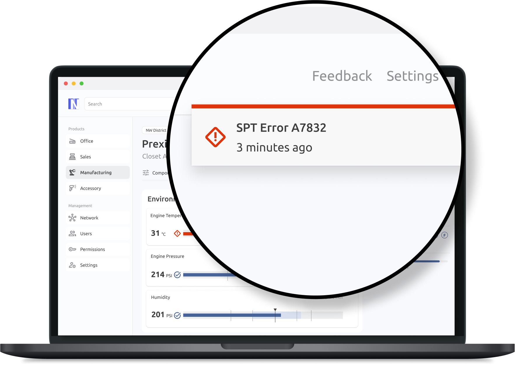
Error notification with systematic copy in production
The Solution
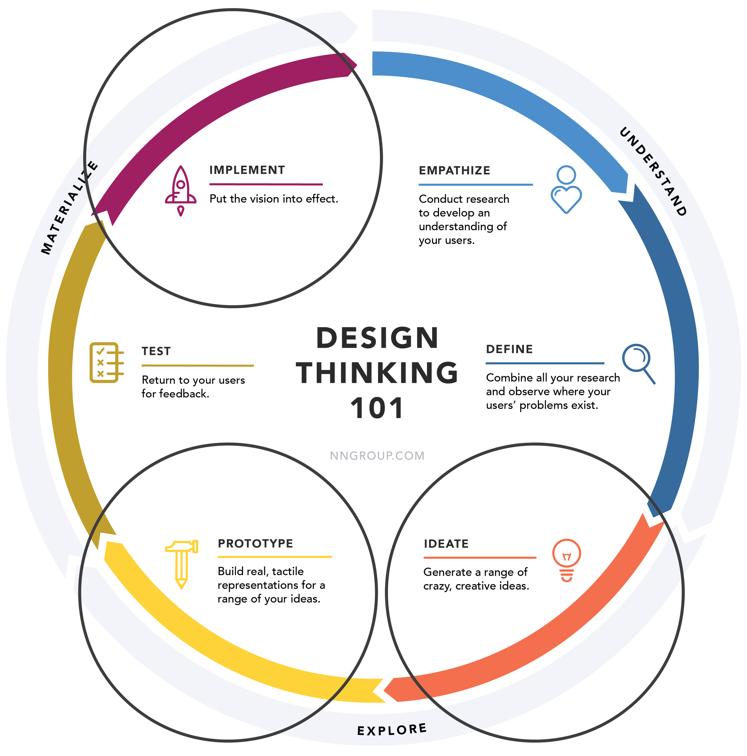
Design Thinking process, www.nngroup.com
As the new UX resource for our Digital Ecosystem products, I needed to support our teams, and get notifications back on track:
Clarify design intent
Iterate designs considering technical feasibility
Establish manageable documentation for use cases
I also had the opportunity to break the ice between Agile and Waterfall teams, as our Firmware and Software teams started collaborating on implementation.
My Process
There is no one-size-fits-all UX methodology. Each project has it’s unique context and constraints. I always spend “just enough” time in the most valuable steps of the Design Thinking Process.
With the abundance of low hanging fruit, and misalignment going under the radar, the later stages of Design Thinking needed more attention for this particular project.

Constraints and Limitations
Along with UX best practices and research findings, some unique constraints and challenges were key factors in my design decisions.
-
Normally, we value working software over comprehensive documentation, but in order to follow Verification and Validation guidelines set by the FDA, documentation should be "clear and unambiguous." I collaborated with Firmware and Systems Engineering partners to reach a sufficient level of detail for our notification requirements.
-
As our new in-house design team (3 total UX designers) was spread across the entire company, our capacity was limited. We were conservative in the responsibilities we committed to, and focused on higher impact, less reversible decisions. Writing copy for every notification, for instance, would not be a wise precedent to set.
-
As our products approached commercialization, we often pivoted and adapted our content to new learnings, especially from manufacturing. Thus, scalability and flexibility were key design principles, when a content-first approach was infeasible.
With the project context defined, and key considerations acknowledged, I was ready to dive in!
Concept Documentation
To ensure consistent decision-making, and save us from constantly fielding questions like “Can we have an orange notification?,” I published lightweight, product-agnostic artifacts for our notifications.
No more redundant discussions over simple decisions
Tactical questions answered, consistent long-term direction


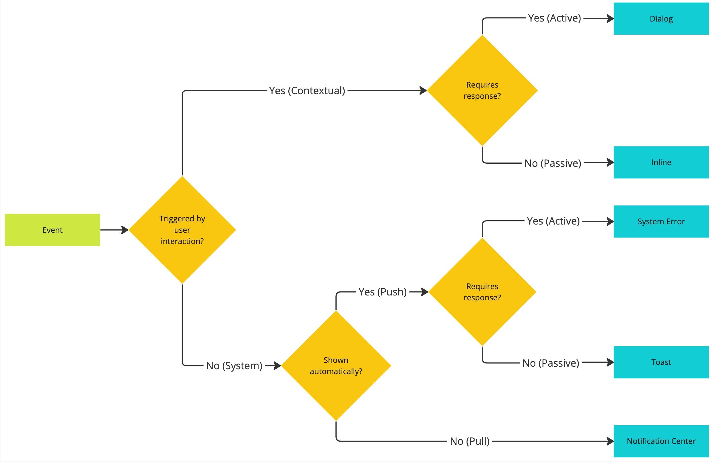
Decision Tree, event to UI component
Design Refinement and Iteration
Our prototypes were beautiful, yet they prioritized aesthetics over technical feasibility and evolving content. In this email summary design, I also refined the prototype for scalability, readability and responsiveness.
Before

After

Technical Documentation
Our notifications were spread across an ecosystem of products, personas, and workflows. The matrix below provided a conceptual framework to meet many needs.
Flexibility to apply in a product-agnostic fashion
Consistent and sustainable between every Digital Ecosystem team
Scalable to different products and personas

Workshops
With a system defined to meet the needs of personalization and progressive disclosure, we were ready to list notification use cases. I led workshops with stakeholders, and shifted our focus from “notifications” to real-world events:
“What will we show the users?”
“What is actually happening in the real world, and what can the users do about it?”

Miro board, process for asynchronously discussing “Events to be Communicated”
All The Details Defined
Once we regrounded notifications as “Events to be Communicated,” I applied our “Bite, Snack, Meal” method. Using UX Writing best practices, and collaborating with our BA’s and systems engineers, we defined every detail development needed to build the notifications.

Spreadsheet, detailed documentation of each notification event, later managed by product owners
When deciding what and how to document, I considered a number of tradeoffs and compromises.
-
In order to manage our capacity as a growing design team, we left the ownership of notification copy to the Product Owners. Instead, our expertise was more valuable at the “pattern-level,” where decisions are less reversible.
-
In order to prevent an unwieldy documentation process, I considered including more variables in our spreadsheet, like “[Low, High] [Data Point] for [Device Name].” I used them to an extent, but never at the expense of matching the copy to the real-world event.
Modal component properties, hi-fidelity mockup
Showcase, user flow from Email Summary to product performance page
Impact + Feedback From Team
[Jack] became a vital part of this complex project. He is a great communicator across our cross-functional teams.
– Product Owner
This definitely provided a lot of clarity to [notifications] for us.
– Systems Engineering
[Jack is] adept at working with our stakeholders directly, always ensuring a consistent and user-centric experience.
– Systems Engineering
300+
Notifications documented across an ecosystem of products
6
Cross-functional teams exercising documentation strategy
What I Learned
-
In regulated industries, there is a lot of sensitivity around requirements, verification, and validation. Our responsibility is to design the best user experience, even if it challenges the status quo.
-
Although we need to settle our vocabulary inflation, UX sometimes needs to walk stakeholders through a story without the lingo. The result is better alignment, and a healthier trust bank account.
-
As UX Designers, we take on a broad sweep of responsibilities. However, I learned that we shouldn’t set a precedent to “help out” beyond our capacity, especially if the work borders on another team’s responsibility.