Reimagining Claims Analysis
Designing a new claims processing tool for a unique insurance market
Summary
In 2024, I spearheaded the UX process for a new application at Securian Financial. In four months, I created a long-term vision for incorporating AI and automation into claims adjudication.
Securian Financial
UX Designer
Figma, Jira, User Testing
Client
My Role
Tools
The Problem
To rebound from the pandemic, Securian planned to expand their Voluntary Benefits business by 6-8 times. This implied a need for more claims examiners. In hopes of avoiding this cost, they funded a project to replace existing legacy applications, and streamline claims examiners’ workflow.
VB Claims business expands, while examiner capacity should remain stable
Current experience involved manual work, information overload, and poor performance
Examiners had a disjointed workflow across several legacy systems. Early on, I conducted user research to dive deeper into current user behaviors and goals.
A new experience needed to be designed, accounting for more centralized data, and automated processes.

Research
To mitigate bias and fill in the gaps, I conducted behavioral + observational research
While stakeholders understood the business requirements and industry nuances examiners dealt with, some more formal user research was needed to validate risky assumptions.
I observed users during their workday, telling them to “work as if I wasn’t here,” and eventually, “I might start to ask you some questions, just to make sure I understand what you’re doing…”
"This is what I spend most of my time doing, scrolling through documents, and waiting for the system to load...."


Along with the observational user interviews, I also facilitated a workshop with our examiners. I asked them to simply imagine they’re starting their workday, and they needed to write on a post-it note what they’d need to do that day.
"Every claim tells a story, and it either makes sense or it doesn't"

These methodologies helped us learn both what users’ behaviors were, and what they thought we should know. We confirmed our hypothesis that the claims processing was the # 1 task to design for. But other alternate tasks I observed were distilled into future work items.
Define
The quick wins, and so much more
During stakeholder interviews, cross-functional workshops, and the User Research I conducted, we confirmed that users would benefit from centralized data and automated processes.

That would reduce the cost of hiring more examiners to deal with this experience. But we also had an opportunity to reimagine the experience more holistically.
UX needed to get ahead
Before we even had a chance to wrap our arms around this complex problem, stakeholders were eager to see progress from developers: they heavily invested in developers. But when I started they had no design to work from.
As a compromise, I created a hi-fidelity prototype for the MVP (or Version 1.0)… with the caveat that the design would change based on user feedback. Our product owner acknowledge that UX needed to get ahead, and we were too rushed to design a scalable, holistic solution.

My Product Owner was aligned with the design versioning process I proposed, and stakeholders agreed to incorporate it into our roadmap. This was a huge success: I finally understood what I needed to do to get UX ahead.

Ideation
Form follows function
I facilitated cross-functional workshops, and found that we answered questions more efficiently when we weren’t hung up on the visual design. For instance, we aligned on how “status” will work throughout the application by collaborating on a whiteboard, instead of iterating a wireframe.
Focusing on “how it will work” instead of “how will it look,” helped me learn a lot faster, and keep them informed on where my recommendation was headed.


Create wildly, refine wisely
In the background, I followed up these sessions with lightweight drawings on post-it notes and sketches. I generated tons of low-fidelity ideas, and quickly moved on from the bad ones.


Prototyping
An iterative approach
Design Version 1—or the MVP—used simple, out-of-the-box MUI patterns. Any complexity that arose from the FE team was easily settled: “whatever’s easiest for now,” since we already agreed to iterate into a new design version.

Dynamic, Reusable Patterns
With Version 2, I had more time to better understand the business and users. This iteration was informed by the exploratory research, concept designs, and clearer documentation.

Testing
Validating the big-bets
Unlike a traditional UX process, much of our design didn’t need to be tested, because it clearly provided its intended value. It followed tried-and-true UX best practices.
But one thing wasn’t clear: where would the long term future take this application? How would we maintain this solution once automation and AI document processing eliminated many of the tasks that are manual today? One idea stood out, but it would take a lot of effort… “We’ll get pushback on this,” “My gut says this is going to be really difficult.”
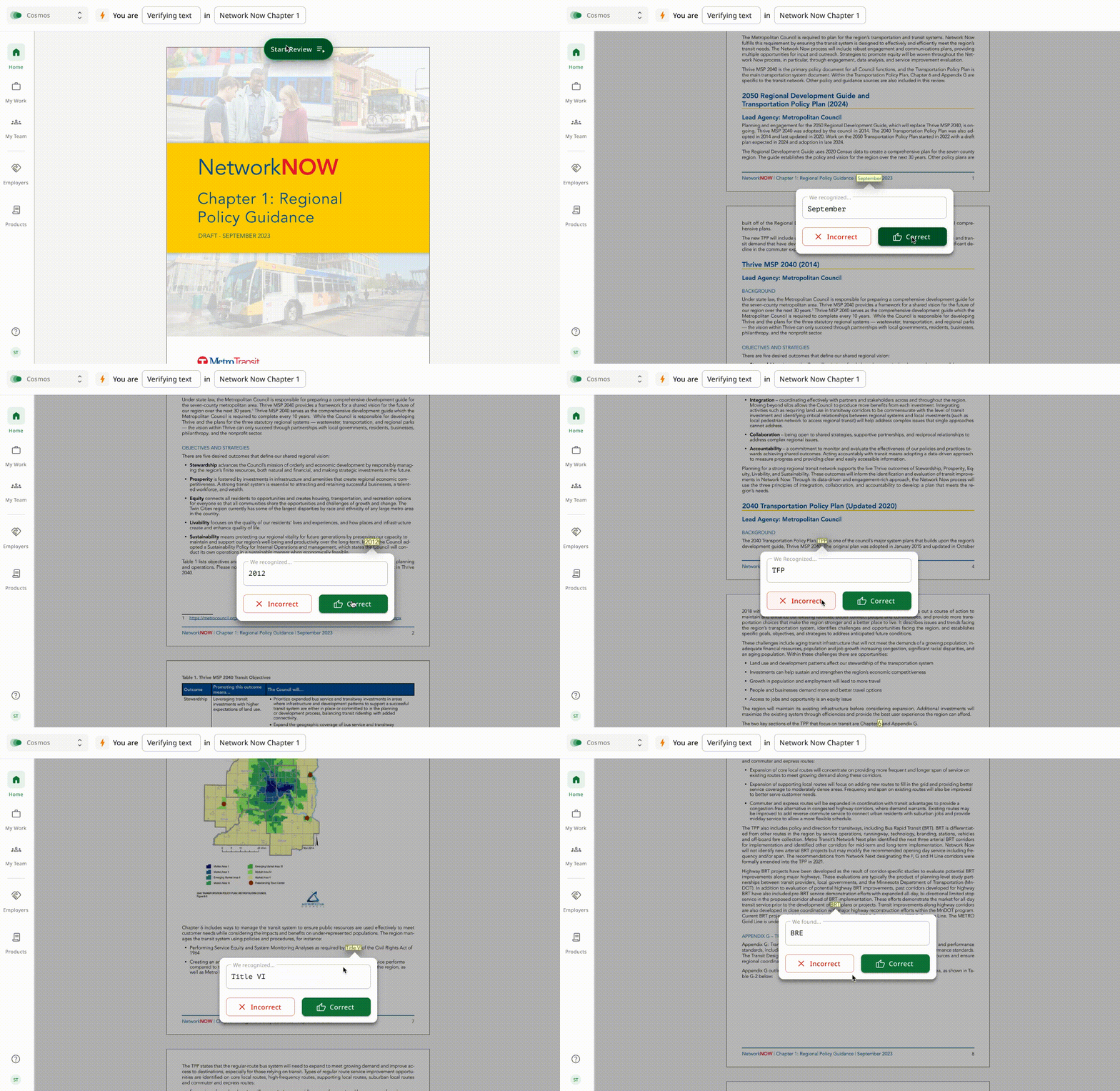
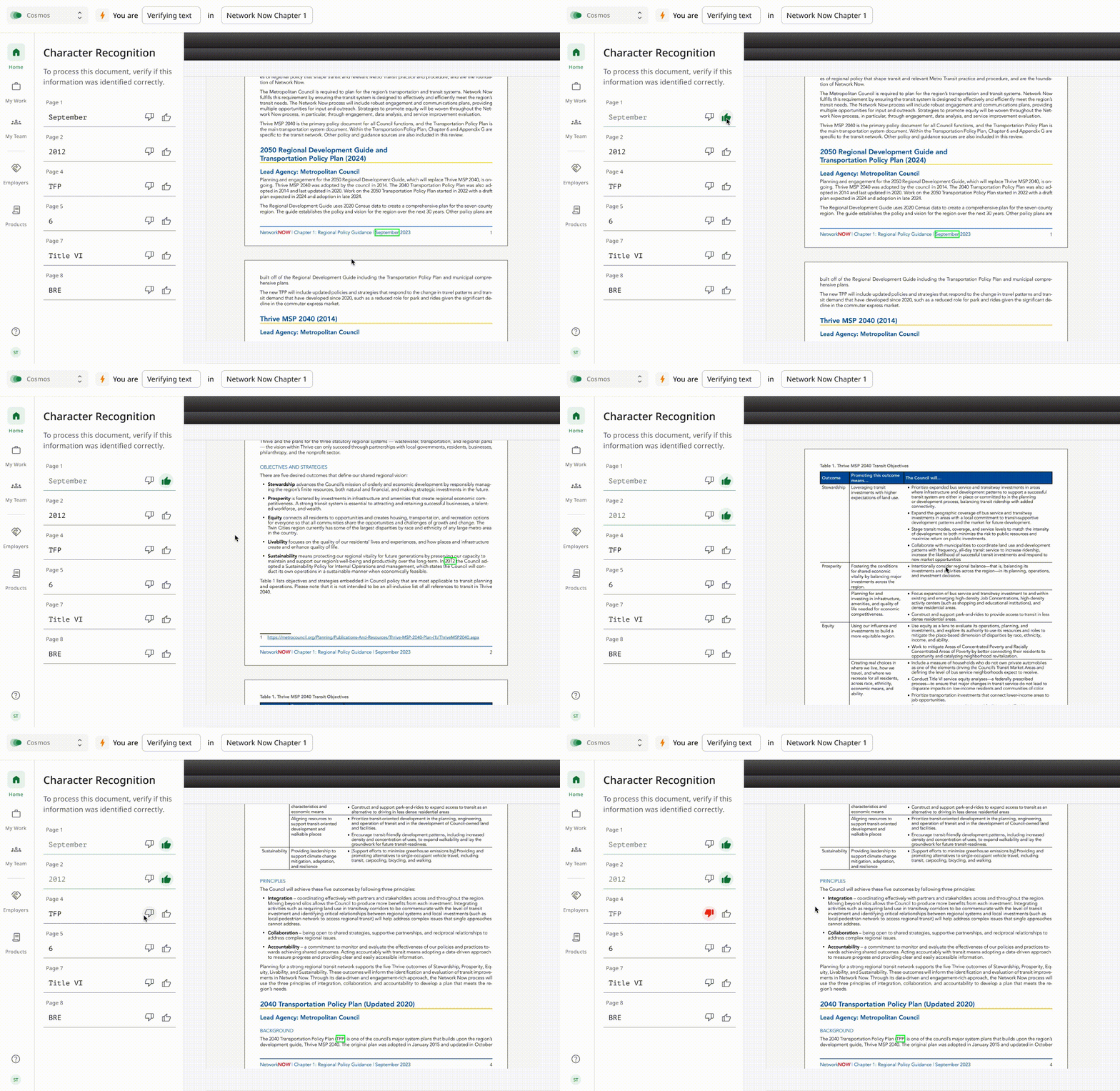
After a couple years, the central task for users would likely be reviewing documents. The existing proprietary file viewer was non-integrated, couldn’t orchestrate a workflow, and overwhelmed users with unnecessary functionality. The proposal was to replace our proprietary file viewer with either another 3rd party solution, or build something new in-house. We all agreed it would be valuable, but valuable enough to justify the cost…?
It was our examiners’ busy season and usability testing wouldn’t be feasible. Instead, I simulated the difference between the existing software, and an enhanced version in a prototype. Through a double blind time-on-task experiment in UserTesting.com, we found that users vastly preferred—and performed better with—the enhanced version.


Implementation
Object oriented documentation
Version 2 was informed by the exploratory research, concept designs, and more thorough attention to the visual design language. With this iteration, we had time to fully wrap our arms around the problem.
