
IoT Notifications Framework
Strategy for encouraging cross-functional alignment, and documenting omnichannel communication experiences
Client
My Role
Confidential*
UX Designer
*In cooperation with my terms of employment, client information is omitted. The material here is substituted or abstracted from the professional work it represents. Please reach out for details.
Project
Professional Work

Mobile App and Portal mockups, visualizing notifications experiences across form-factors
BACKGROUND
Where did I start?
I joined the client after an agency handed off ambitious, exciting deliverables! It was time to execute… but there were still unanswered questions, ambiguous concepts, and cross-functional misalignment.
As a UX designer on our newly formed Design + Human Factors team, I had unique opportunities while leading the effort to “steer the notifications ship.”
Communicating and visualizing product-agnostic behavior, anatomy
Setting a precedent for our team’s design model documentation
Encouraging trust and accountability between Waterfall and Agile teams
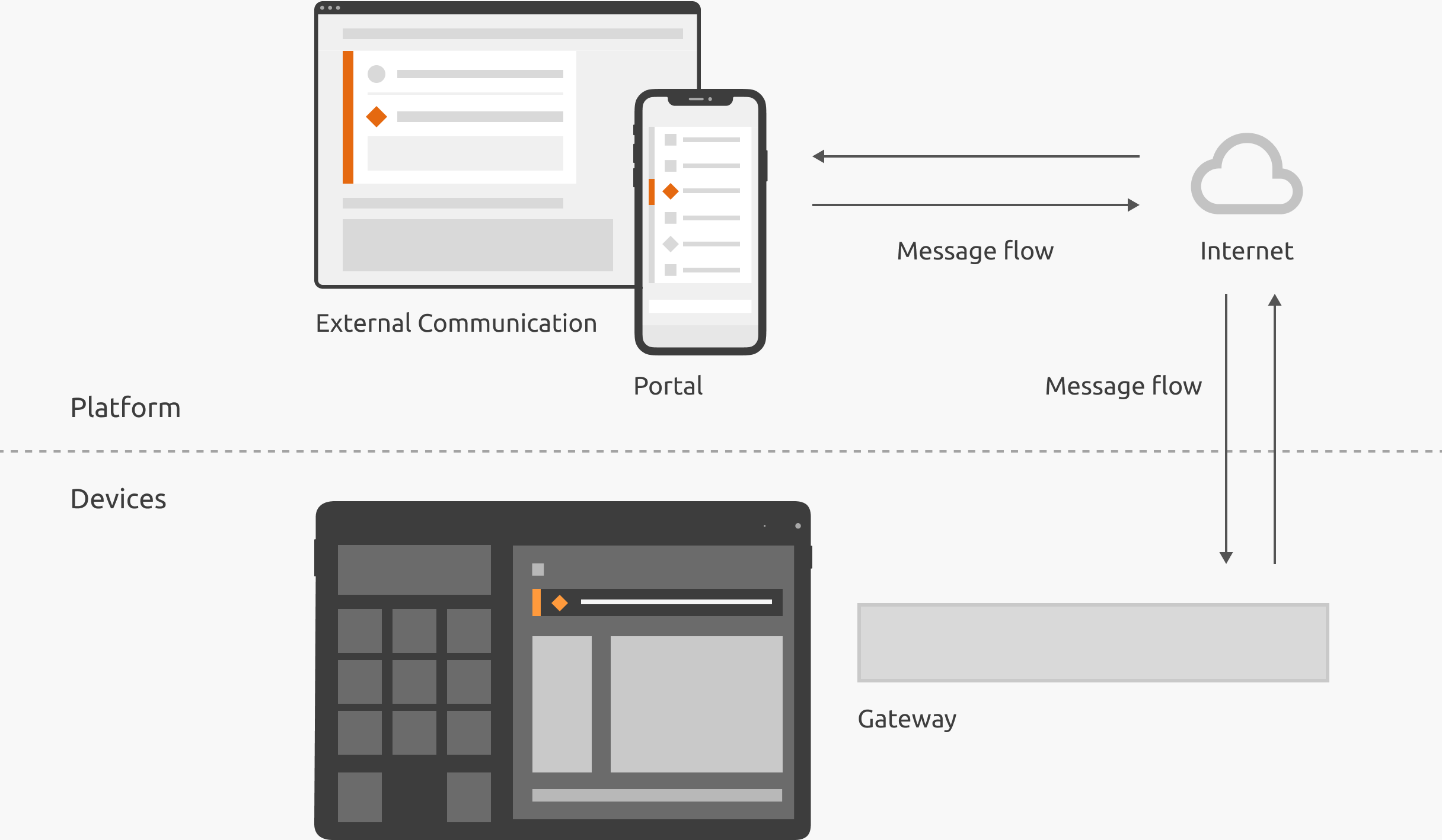
Infographic, IoT system model illustrating flow for messages like notification events
What good is design without execution?
THE PROBLEM

Annotations, bugs captured during implementation
From the beginning, I noticed that stakeholders needed clarity around notifications.
Implementation not matching design model
Frequent questions around intent
Confusion swept under the rug
What limitations did we deal with?
The context of unreleased products in a regulated industry also presented unique considerations.
Adapting to insights during manufacturing
Documenting design intent unambiguously for requirements

Infographic, V-Model software development, the practice followed by our broader team
OUR PROCESS
How did we work?

Infographic, Staggered Design Process
To leverage the “What-When-How” distribution, we used a Staggered Design Process.
-
Designs in a discovery status are usually low-fidelity, and sensitive to significant change. When the updates become more conservative refinements, the project is considered Active. Once the design is ready for development, it’s duplicated and frozen in a Support state. Changed are exclusively made to the Support iteration when deemed necessary for development.
-
Roughly, UX answers the “What,” Product answer the “When,” and Engineering answers the “How.” While the lines are blurry, we chose Staggered Design so that we could simultaneously design openly for future iterations, while responding to the “When” and “How” with the Support iteration.
How do we clarify the design model?
APPROACH
First, I visualized various parts of the concept in the abstract, in order to promote its scalable, consistent application across projects and form-factors.
Decision Tree for determining UI component from real-world event
Relationship between User Type, Preferences, and notification content
Annotations for notification anatomy and behavior

Decision Flowchart – Defining UI component(s) for an event
How does this clarify notifications?
Concept Designs, and Design System guidelines are artifacts that help guide manageable manageable cross-functional processes, and consistent implementations.
Pull stakeholders out of the weeds, understand the big-picture
Bypass redundant conversations, or excessive prototyping to clarify intent
Engage understanding, alignment
Using our Staggered Design process, we froze the concept for implementation support (from Miro to Confluence, in this case).

Annotations, product-agnostic notification anatomy

Annotations, product-agnostic behavior
SOLUTION
Putting it into Practice
Personalization, preferences, content categories, triggers… It’s all overwhelming for the non-designer.
“We just need a dialog for this.”
“Can we make an orange-type notification?”
To reduce complexity and “soutioneering,” I encouraged us to discuss each notification as an “Event to be Communicated.”

Screenshot, portion of Events to be Communicated, a template to asynchronously gather use cases for notifications
Adding the Detail
By thinking about notifications in the abstract as “Events to be Communicated,” I shifted the narrative.
What should we show the users?
What is actually happening in the real world, and what might the users do about it?
With the actual events well understood, we were better equipped to align on the details: meaningful, actionable, and verifiable communication experiences.

Screenshot, portion of notifications spreadsheet managed by UX and Engineering
What did I learn?
-
In regulated industries, there is a lot of sensitivity around requirements, verification, and validation. Our responsibility is to design the best user experience, even if it challenges the status quo.
-
While we have a responsibility to settle our vocabulary inflation, UX sometimes needs to walk stakeholders through a use case, without the lingo. The result is better alignment, and a healthier trust bank account.
-
As UX Designers, we take on a broad sweep of responsibilities. However, I learned that we shouldn’t set a precedent to “help out” beyond our capacity, especially if the work borders on another team’s responsibility.