
IoT Notifications Framework
Strategy for delivering omnichannel communication experiences, and encouraging cross-functional alignment
Background
My client is a manufacturer of food service devices. When I joined, an agency had handed off exciting, ambitious deliverables for an Internet of Things (IoT) digital ecosystem! It was time to execute. But there were still unanswered questions, and cross-functional misalignment.
Working in a regulated industry with unreleased products presented some unique, exciting opportunities. These factors were crucial to my design decisions.
-
Verification and validation are processes required by the FDA. To test accurately, requirements (unambiguous documentation) is needed in this industry than others. In my case, this also involved “breaking the ice” between siloed waterfall and agile teams.
-
As our Design + Human Factors team (3 total UX designers) was spread across the entire company, our capacity was limited. We needed to be conservative in the responsibilities we committed to, and focused on evangelizing UX at the company.
-
While a content-first approach would lead to more effective IA and UI patterns, this was not always possible. Much of the content we designed for was not determined yet, or could not be determined until the products were released.
Client
My Role
Tools
Figma, Miro, Confluence
Confidential*
UX Designer (1 of 2)
*In cooperation with my terms of employment, client information is omitted. The material here is substituted or abstracted from the professional work it represents. Please reach out for details.
Challenges + Constraints
Moreover, I accounted for the IoT product posture with special consideration to a few principles: connectivity, product setup, contextual help, and interusability, to name a few.
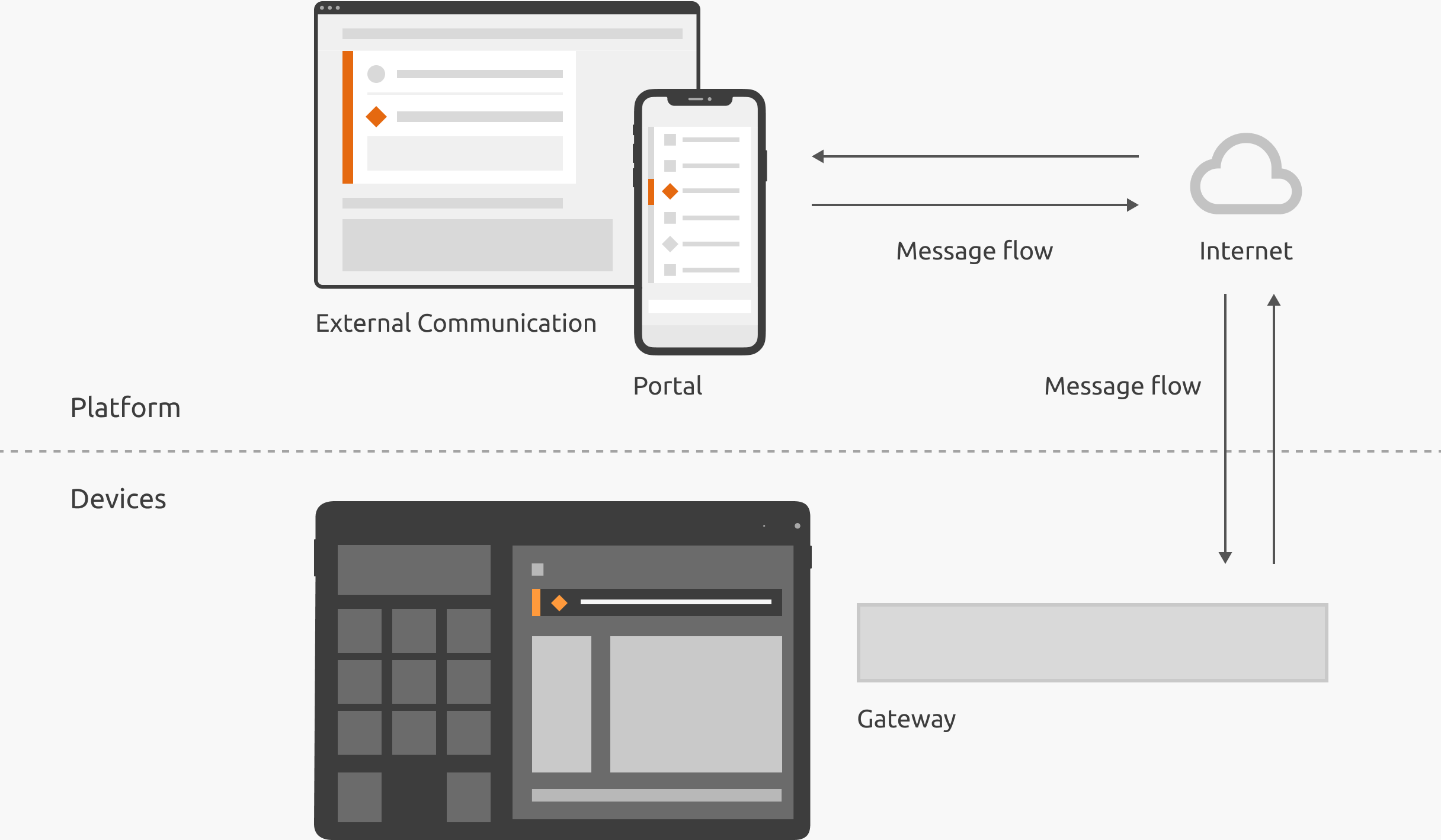
Infographic, IoT system model illustrating flow for messages like notification events
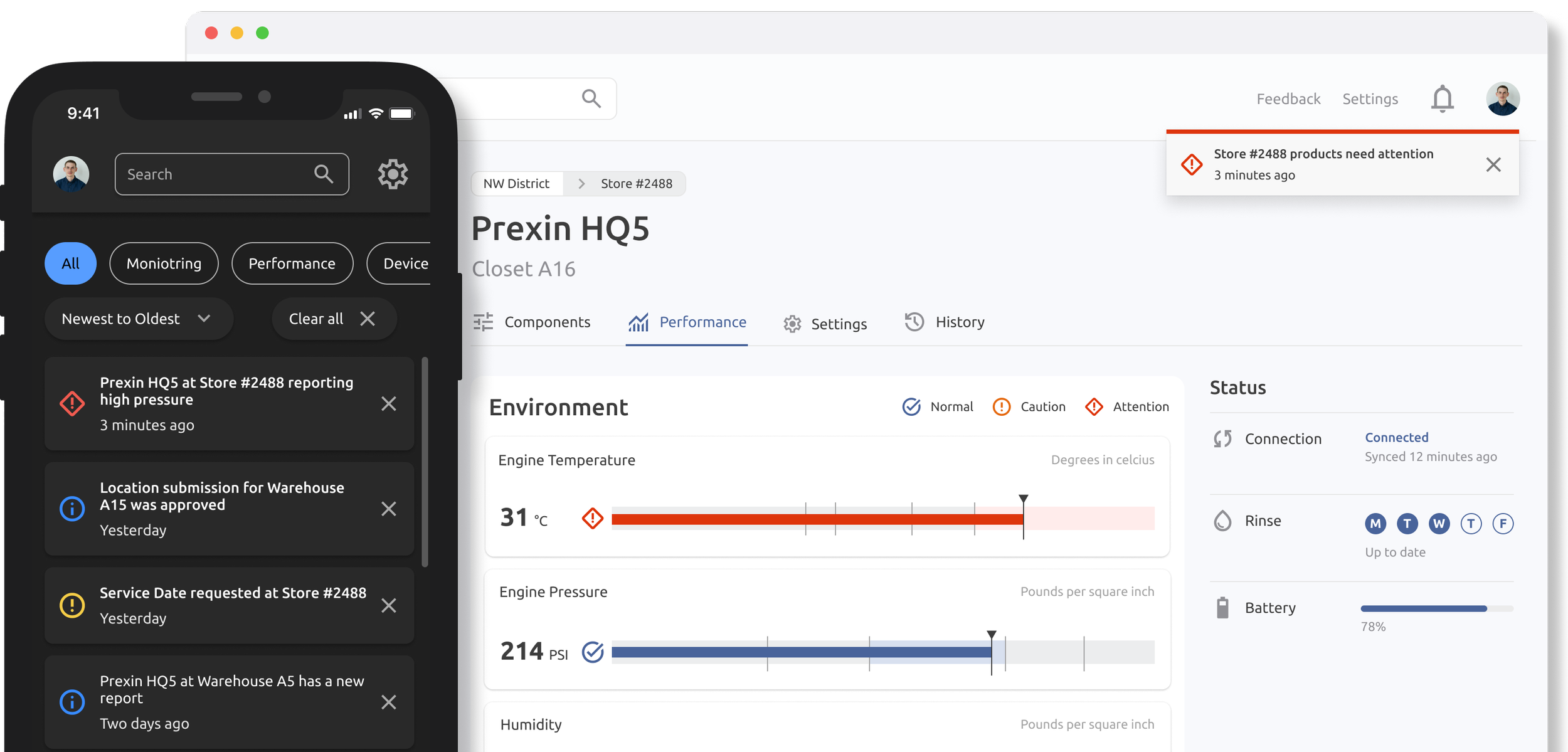
The Problem
Our agency had created high-level, abstract concept designs which non-designers struggled to understand without my help. Stakeholder feedback, and demos in Sprint Reviews showed that this original approach to notifications had lacked clarity, and bypassed engineering’s input.
-
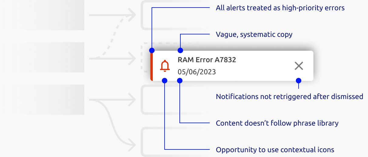
Notifications included systematic verbiage, didn’t distinguish between urgency, and didn’t provide actionable information. These deviations from UX best practices were common.
-
We responded to questions like “What does this color mean again?,” and immediate solutions, like “users should see a dialog for that.” Tackling these individual interactions, while meaningful, was wasteful when repeated multiple times across several teams.
-
Initially we stood previous design decisions in order to preserve the holistic design; however, this may have impacted our launch timelines. As a team player, I agreed to refinements that would benefit both parties.
Simply put, notifications made sense to us, but not to other stakeholders. Because of these unclear concepts, we were already implementing communication experiences that neglected basic design principles.

Concept design, original mapping of Partner Relationship to personalized Information Level
Implementation, annotations for bugs captured
Approach
In order to consistently deliver actionable and meaningful communication experiences, we needed to clarify our design intent, update our prototypes as needed, and establish a manageable process for documenting use cases.


Clarify Concepts
I created artifacts to aid decision making and mitigate confusion, centered around the most complex concepts. These, including many others, were published to Sharepoint for stakeholders, and kept in Miro for an active design version.
Despite design system guidelines, we frequently re-articulated the purpose and benefits of notification UI components to stakeholders. This decision tree helps bypass those redundant conversations, and articulate our decisions asynchronously, so that we can spend time on more impactful conversations.

Decision Tree – Defining UI component(s) for an event
Annotations, product-agnostic notification anatomy
Annotations, product-agnostic behavior


Visualizing these concepts in the abstract (without high fidelity components), also shows how it can apply in a consistent, product-agnostic fashion. For instance, as a stakeholder, I can easily access this document to review the expected notification anatomy and behavior regardless of the product.
SOLUTION
Putting it into Practice
Personalization, preferences, content categories, triggers… It’s all overwhelming for the non-designer.
“We just need a dialog for this.”
“Can we make an orange-type notification?”
To reduce complexity and “soutioneering,” I encouraged us to discuss each notification as an “Event to be Communicated.”

Screenshot, portion of Events to be Communicated, a template to asynchronously gather use cases for notifications
Adding the Detail
By thinking about notifications in the abstract as “Events to be Communicated,” I shifted the narrative.
What should we show the users?
What is actually happening in the real world, and what might the users do about it?
With the actual events well understood, we were better equipped to align on the details: meaningful, actionable, and verifiable communication experiences.

Screenshot, portion of notifications spreadsheet managed by UX and Engineering
What did I learn?
-
In regulated industries, there is a lot of sensitivity around requirements, verification, and validation. Our responsibility is to design the best user experience, even if it challenges the status quo.
-
While we have a responsibility to settle our vocabulary inflation, UX sometimes needs to walk stakeholders through a use case, without the lingo. The result is better alignment, and a healthier trust bank account.
-
As UX Designers, we take on a broad sweep of responsibilities. However, I learned that we shouldn’t set a precedent to “help out” beyond our capacity, especially if the work borders on another team’s responsibility.